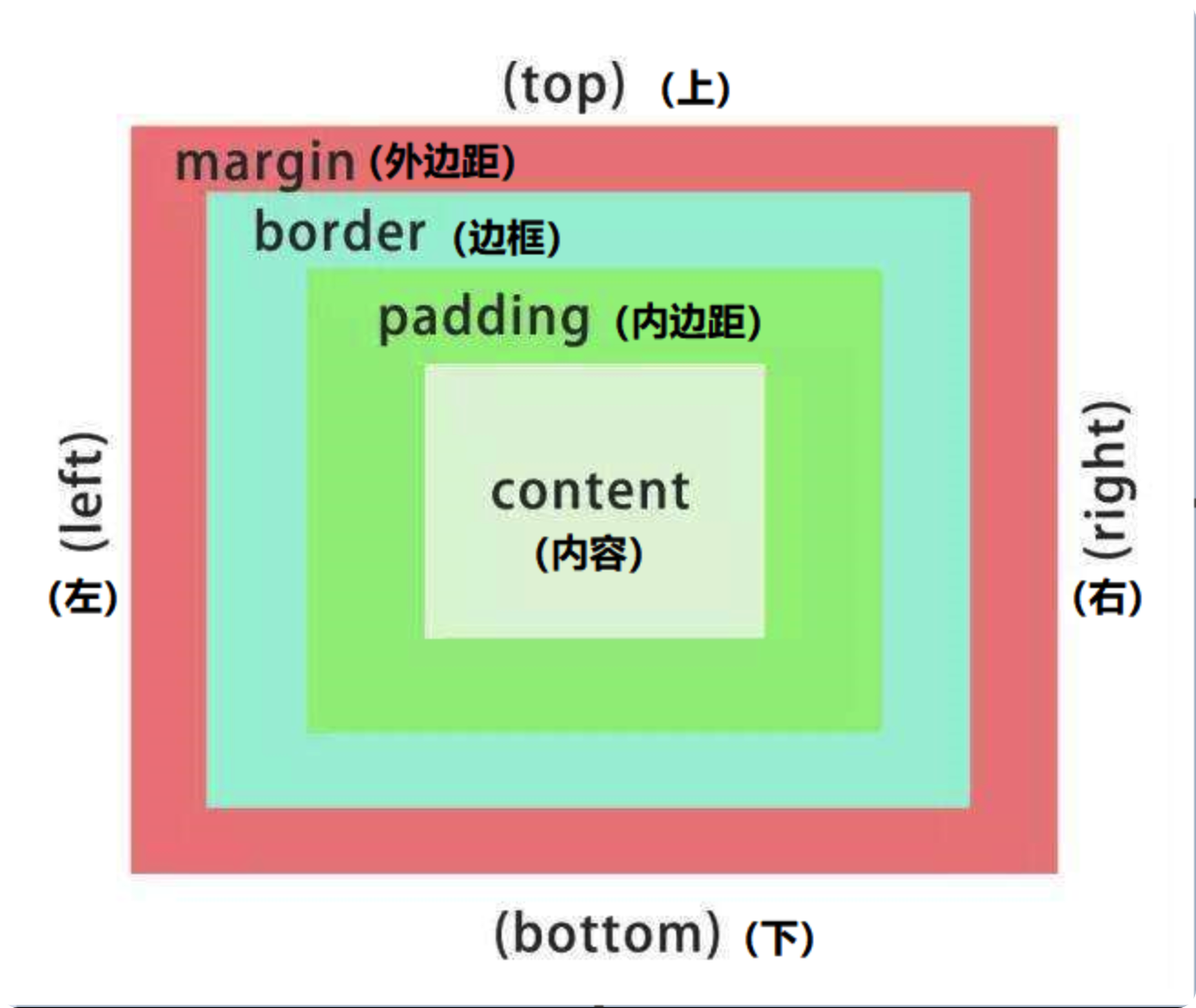
一、 盒子模型
盒子模型: 就是把 HTML 页面中的布局元素看做一个矩形盒子,也就是能装内容的容器。
css 盒子模型本质上时一个盒子,封装周围的 HTML 元素,它包括表框、内边距、外边距 和 实际内容。

去除无序列表前的小圆点:list-style: none;
1. 边框(border)
border : 可以设置元素的边框。
边框的大小会影响到盒子的大小
语法:
1
| border: border-width | border-style | border-color;
|
边框参数:
| 属性 | 作用 |
|———————|—————————————-|
| border-width | 定义边框的粗细,单位是 px |
| border-style | 定义边框的样式 |
| border-color | 定义边框的颜色 |
样式参数:
| 参数 |
效果 |
| none |
没有表框 |
| hidden |
隐藏边框 |
| solid |
实现边框 |
| dashed |
虚线边框 |
| dotted |
点线边框 |
| groove |
3D 沟槽 |
| ridge |
3D 凸起 |
| inset |
3D 嵌入 |
| outset |
3D 起始 |
代码示例
1
2
3
4
5
6
7
8
9
10
11
12
13
14
15
16
17
18
19
20
21
22
23
24
25
26
27
28
29
30
31
32
33
34
35
36
| <!DOCTYPE html>
<html>
<head>
<meta charset="utf-8">
<title></title>
<style type="text/css">
.bk1, .bk2,.bk3,.bk4,.bk5,.bk6{
width: 100px;
height: 30px;
border-width: 10px;
margin-top: 20px;
border-color: green;
}
.bk1{border-style: solid;}
.bk2{border-style: dashed;}
.bk3{border-style: dotted;}
.bk4{border-style: groove;}
.bk5{border-style: ridge;}
.bk6{border-style: inset;}
.bk7{border-style: outset;}
</style>
</head>
<body>
<div class="bk1"></div>
<div class="bk2"></div>
<div class="bk3"></div>
<div class="bk4"></div>
<div class="bk5"></div>
<div class="bk6"></div>
<div class="bk7"></div>
</body>
</html>
|
复合写法
语法:
代码示例
1
2
3
4
5
6
7
8
9
10
11
12
13
14
15
16
17
18
19
20
21
22
| <!DOCTYPE html>
<html>
<head>
<meta charset="utf-8">
<title></title>
<style type="text/css">
.bk1 {
width: 300px;
height: 100px;
border: 10px solid blue;
border-top-color: red;
}
</style>
</head>
<body>
<div class="bk1"></div>
</body>
</html>
|
相邻边框合并(border-collapse)
border-collapse: 可以使相邻的两个边框合并在一起
语法:
1
| border-collapse: collapse;
|
代码示例
1
2
3
4
5
6
7
8
9
10
11
12
13
14
15
16
17
18
19
20
21
22
23
24
25
26
27
28
29
30
31
32
33
34
35
36
37
38
39
40
41
42
43
44
45
46
47
48
49
50
51
52
53
54
55
56
57
58
59
60
61
62
63
64
65
| <!DOCTYPE html>
<html>
<head>
<meta charset="utf-8" />
<title></title>
<style type="text/css">
table {
margin-top: 10px;
width: 300px;
height: 150px;
}
td,
th {
text-align: center;
border: 1px solid pink;
}
.b1 {
border-collapse: collapse;
}
</style>
</head>
<body>
<table class="b1" cellspacing="0">
<th>姓名</th>
<th>年龄</th>
<th>职业</th>
<tr>
<td>刘德华</td>
<td>18</td>
<td>演员</td>
</tr>
<tr>
<td>郭富城</td>
<td>20</td>
<td>歌手</td>
</tr>
<td>张学友</td>
<td>19</td>
<td>歌手</td>
</table>
<table class="b2" cellspacing="0">
<th>姓名</th>
<th>年龄</th>
<th>职业</th>
<tr>
<td>刘德华</td>
<td>18</td>
<td>演员</td>
</tr>
<tr>
<td>郭富城</td>
<td>20</td>
<td>歌手</td>
</tr>
<td>张学友</td>
<td>19</td>
<td>歌手</td>
</table>
</body>
</html>
|
2. 内边距(padding)
padding :可以设置内容与边框之间的距离。
内边距也会影响盒子的大小,想要盒子大小不变时,需要先减去两边的内边距。
如果盒子本身没有指定 height 或 width,那么 padding 不会撑开盒子的大小
属性:
| 属性 | 作用 |
|————————|—————|
| padding-top | 上内边距 |
| padding-right | 右内边距 |
| padding-left | 左内边距 |
| padding-bottom | 下内边距 |
padding 简写
padding 在简写值是,需要遵守 上 - 右 - 下 - 左 的顺序。
| 属性 |
值的个数 |
说明 |
| padding: 5px |
1 个值 |
四个内边距都是 5px |
| padding: 5px 10px |
2 个值 |
上下为 5px,左右为 10px |
| padding: 5px 10px 20px |
3 个值 |
上为 5px, 左右为 10px, 下为 5px |
| padding: 5px 10px 15px 20px |
4 个值 |
上为 5px,右为 10px,下为 15px,左为 20px |
代码示例
1
2
3
4
5
6
7
8
9
10
11
12
13
14
15
16
17
18
19
20
21
22
23
24
25
26
27
28
29
30
31
32
33
34
35
| <!DOCTYPE html>
<html lang="en">
<head>
<meta charset="UTF-8" />
<meta http-equiv="X-UA-Compatible" content="IE=edge" />
<meta name="viewport" content="width=device-width, initial-scale=1.0" />
<title>Document</title>
<style>
div {
width: 100px;
height: 100px;
border: 2px solid green;
margin-top: 10px;
}
.d1 {
padding: 5px;
}
.d2 {
padding: 5px 10px;
}
.d3 {
padding: 5px 10px 15px;
}
.d4 {
padding: 5px 10px 15px 20px;
}
</style>
</head>
<body>
<div class="d1">|四个内边距都是5px|</div>
<div class="d2">上下为 5px,左右为 10px</div>
<div class="d3">上为 5px, 左右为 10px, 下为5px</div>
<div class="d4">上为5px,左为10px,下为15px,右为20px</div>
</body>
</html>
|
案例一
代码示例
1
2
3
4
5
6
7
8
9
10
11
12
13
14
15
16
17
18
19
20
21
22
23
24
25
26
27
28
29
30
31
32
33
34
35
36
37
38
39
40
| <!DOCTYPE html>
<html lang="en">
<head>
<meta charset="UTF-8" />
<meta http-equiv="X-UA-Compatible" content="IE=edge" />
<meta name="viewport" content="width=device-width, initial-scale=1.0" />
<title>Document</title>
<style>
.dchh {
border-top: 3px solid #ff8500;
border-bottom: 1px solid #edeef0;
height: 41px;
background-color: #fcfcfc;
}
.dchh a {
display: inline-block;
text-align: center;
padding: 0 20px;
line-height: 41px;
text-decoration: none;
color: #4c4c4c;
font-size: 12px;
}
.dchh a:hover {
background-color: #eee;
color: #ff8500;
}
</style>
</head>
<body>
<div class="dchh">
<a href="#">设为首页</a>
<a href="#">手机新浪网</a>
<a href="#">移动客户端</a>
<a href="#">博客</a>
<a href="#">微博</a>
<a href="#">关注我</a>
</div>
</body>
</html>
|
3. 外边距(margin)
margin:用来控制盒子与盒子之间的距离。
margin 的设置方法和 padding 是完全一致的。
1. 清除内外边距
为了防止某些元素自带的内外边距导致布局混乱,一般在网页开始时,同意清除所有元素的内外边距。
为了保证行内元素的兼容性,一般只设置左右的内外边距,转为块元素则不用考虑。
语法:
1
2
3
4
| * {
margin: 0;
padding: 0;
}
|
盒子水平居中
- 要想盒子水平居中,则盒子必须设置了宽度;
- 设置盒子左右的 margin 为
auto 即可;
- 行内元素或行内块元素需要水平居中时,给他的父元素增加
text-aling: center 即可;
代码示例
1
2
3
4
5
6
7
8
9
10
11
12
13
14
15
16
17
18
19
20
21
22
23
24
25
| <!DOCTYPE html>
<html lang="en">
<head>
<meta charset="UTF-8">
<meta http-equiv="X-UA-Compatible" content="IE=edge">
<meta name="viewport" content="width=device-width, initial-scale=1.0">
<title>Document</title>
<style>
.dchh {
width: 300px;
background-color: pink;
height: 200px;
margin: 0 auto;
}
</style>
</head>
<body>
<div class="dchh">
</div>
</body>
</html>
|
外边距合并(嵌套块元素垂直外边距塌陷)
对于两个嵌套(父子关系)的块元素,父元素有上外边距同时子元素也有上外边距,此时父元素会塌陷较大的外边距值。
外边距塌陷的解决办法:
- 为父元素定义上边框:
border: 1px solid transparent; (透明边框)
- 为父元素定义内边距:
padding: 1px;
- 为父元素添加属性:<mark>
overflow: hidden; </mark>
代码示例
1
2
3
4
5
6
7
8
9
10
11
12
13
14
15
16
17
18
19
20
21
22
23
24
25
26
27
28
29
30
31
32
33
34
| <!DOCTYPE html>
<html lang="en">
<head>
<meta charset="UTF-8">
<meta http-equiv="X-UA-Compatible" content="IE=edge">
<meta name="viewport" content="width=device-width, initial-scale=1.0">
<title>Document</title>
<style>
.dchh {
width: 300px;
background-color: pink;
height: 200px;
margin-top: 20px;
overflow: hidden;
}
.dchh div {
margin-top: 30px;
width: 150px;
height: 150px;
background-color: green;
}
</style>
</head>
<body>
<div class="dchh">
<div></div>
</div>
</body>
</html>
|
案例一
代码示例
1
2
3
4
5
6
7
8
9
10
11
12
13
14
15
16
17
18
19
20
21
22
23
24
25
26
27
28
29
30
31
32
33
34
35
36
37
38
39
40
41
42
43
44
45
46
47
48
49
50
51
52
53
54
55
56
57
58
59
60
61
62
63
64
65
66
67
68
69
70
71
72
73
74
75
76
77
78
79
80
81
82
83
84
85
86
87
88
89
90
91
92
93
94
95
96
97
98
99
100
101
102
103
104
105
106
107
108
109
110
111
112
113
114
115
116
117
118
119
120
121
122
123
124
125
126
127
128
129
130
131
132
133
134
135
136
137
138
139
140
141
142
143
144
145
146
147
148
149
150
151
| <!DOCTYPE html>
<html lang="en">
<head>
<meta charset="UTF-8">
<meta http-equiv="X-UA-Compatible" content="IE=edge">
<meta name="viewport" content="width=device-width, initial-scale=1.0">
<title>Document</title>
<style>
* {
	margin: 0;
	padding: 0;
}
body {
background-color: #f5f5f5;
}
.bnti {
font-weight: 400;
font-size: 18px;
margin: 20px 160px 5px;
}
.jx {
color: red;
font-weight: 700;
margin-left: 140px;
}
ul {
width: 1600px;
height: 500px;
margin: 0 auto;
overflow: hidden;
}
li {
display: inline-block;
width: 298px;
height: 415px;
margin-right: 10px;
background-color: #fff;
}
img {
width: 100%;
height: 215px;
}
.jpuc {
font-size: 14px;
line-height: 1.8em;
height: 70px;
padding: 0 28px;
margin-top: 30px;
}
.ldyr {
font-size: 12px;
color: #b0b0b0;
padding: 0 28px;
margin-top: 20px;
}
.mdmd p {
display: inline-block;
}
.name {
font-size: 14px;
margin-top: 15px;
padding: 0 28px;
}
.jxge {
font-size: 16px;
color: red;
border-left: 2px solid rgb(217, 216, 218);
padding-left: 10px;
}
a {
text-decoration: none;
display: block;
color: black;
}
</style>
</head>
<body>
<div class="dchh">
<h3 class="bnti">热评产品</h3>
<div class="jx">+</div>
<ul>
<li class="ip1">
<a href="#">
<div><img src="https://img.pupper.cn/img/6651596c01f7dc9c8b51b1acdbbcfbca-2021-11-18.jpeg" alt="">
</div>
<p class="jpuc">黑马程序员pink老师前端入门教程,零基础必看的移动端前端视频教程</p>
<p class="ldyr">来自于 123456677888 的评价</p>
<div class="mdmd">
<p class="name">黑马程序员pink老师</p>
<p class="jxge">99.9元</p>
</div>
</a>
</li>
<li>
<a href="#">
<div><img src="https://img.pupper.cn/img/c2627e804856411944e52485d97936d5-2021-11-18.jpeg" alt="">
</div>
<p class="jpuc">黑马程序员pink老师前端入门教程,零基础必看的移动端前端视频教程</p>
<p class="ldyr">来自于 123456677888 的评价</p>
<div class="mdmd">
<p class="name">黑马程序员pink老师</p>
<p class="jxge">99.9元</p>
</div>
</a>
</li>
<li>
<a href="#">
<div><img src="https://img.pupper.cn/img/da9e1f01a9f9c801404d86dfb7fbe79a-2021-11-18.jpeg" alt="">
</div>
<p class="jpuc">黑马程序员pink老师前端入门教程,零基础必看的移动端前端视频教程</p>
<p class="ldyr">来自于 123456677888 的评价</p>
<div class="mdmd">
<p class="name">黑马程序员pink老师</p>
<p class="jxge">99.9元</p>
</div>
</a>
</li>
<li>
<a href="#">
<div><img src="https://img.pupper.cn/img/e222bc7e43f5db72d00f4f49b925400c-2021-11-18.jpeg" alt="">
</div>
<p class="jpuc">黑马程序员pink老师前端入门教程,零基础必看的移动端前端视频教程</p>
<p class="ldyr">来自于 123456677888 的评价</p>
<div class="mdmd">
<p class="name">黑马程序员pink老师</p>
<p class="jxge">99.9元</p>
</div>
</a>
</li>
</ul>
</div>
</body>
</html>
|
案例二
消除无序列表中的小圆点:list-style: none;
代码示例
1
2
3
4
5
6
7
8
9
10
11
12
13
14
15
16
17
18
19
20
21
22
23
24
25
26
27
28
29
30
31
32
33
34
35
36
37
38
39
40
41
42
43
44
45
46
47
48
49
50
51
52
53
54
55
56
57
| <!DOCTYPE html>
<html lang="en">
<head>
<meta charset="UTF-8">
<meta http-equiv="X-UA-Compatible" content="IE=edge">
<meta name="viewport" content="width=device-width, initial-scale=1.0">
<title>Document</title>
<style>
* {
margin: 0;
padding: 0;
}
.box {
width: 248px;
height: 163px;
border: 1px solid #ccc;
overflow: hidden;
margin: 10px auto;
color: #666;
}
.bnti {
font-weight: normal;
padding: 0 25px;
font-size: 14px;
height: 32px;
line-height: 32px;
border-bottom: 1px dotted #ccc;
}
.tehv {
font-size: 12px;
height: 23px;
line-height: 23px;
}
.tehv a {
text-decoration: none;
color: #666;
}
.kkbc {
margin: 7px 0 0 23px;
list-style: none;
}
</style>
</head>
<body>
<div class="box">
<h4 class="bnti">品优购快报</h4>
<ul class="kkbc">
<li class="tehv"><a href="#">【特惠】爆款耳机5折秒!</a></li>
<li class="tehv"><a href="#">【特惠】爆款耳机5折秒!</a></li>
<li class="tehv"><a href="#">【特惠】爆款耳机5折秒!</a></li>
<li class="tehv"><a href="#">【特惠】爆款耳机5折秒!</a></li>
</ul>
</div>
</body>
</html>
|
二、 圆角及阴影
1. 圆角(border-radius)
border-radius:用于设置边框的圆角
语法:
border-radius 可以分别设置四个角,顺序为 左上(border-top-left-radius) - 右上(border-top-right-radius) - 右下(border-bottom-left-radius) - 左下(border-top-right-radius)
- 如果想要一个圆形,border-radius = 正方形的边的一半 px 或 50% ;
- 如果想要一个矩形圆角,border-radius = 长方形的高的一半 px 或 高的 50%;
简写:
| 写法 | 值的个数 | 含义 |
|——————————————————-|—————|——————————————————-|
| border-radius: 10px; | 1 个值 | 四个角的弧度都是 10px |
| border-radius: 10px 20px; | 2 个值 | 左上右下=10px,右上左下=20px |
| border-radius: 10px 20px 30px; | 3 个值 | 左上=10px,右上左下=20px,右下=30px |
| border-radius: 10px 20px 30px 40px; | 4 个值 | 四个角分别对应一个值 |
代码示例
1
2
3
4
5
6
7
8
9
10
11
12
13
14
15
16
17
18
19
20
21
| <!DOCTYPE html>
<html lang="en">
<head>
<meta charset="UTF-8">
<meta http-equiv="X-UA-Compatible" content="IE=edge">
<meta name="viewport" content="width=device-width, initial-scale=1.0">
<title>Document</title>
<style>
.box {
width: 300px;
height: 300px;
background-color: pink;
border-radius: 20px;
}
</style>
</head>
<body>
<div class="box"></div>
</body>
</html>
|
2. 盒子阴影(box-shadow)
box-shadow:用于设置盒子阴影
语法:
1
| box-shadow: h-shadow v-shadow blur spread color inset;
|
参数;
| 值 | 描述 |
|—————|———————————————————————|
| h-shadow | 必填,水平阴影的位置,允许负值 |
| v-shadow | 必填,垂直阴影的位置,允许负值 |
| blur | 选填,模糊度 |
| spread | 选填,阴影尺寸 |
| color | 选填,阴影颜色 |
| inset | 选填,将外部阴影改为内部阴影(默认为外阴影) |
代码示例
1
2
3
4
5
6
7
8
9
10
11
12
13
14
15
16
17
18
19
20
21
22
23
24
| <!DOCTYPE html>
<html lang="en">
<head>
<meta charset="UTF-8">
<meta http-equiv="X-UA-Compatible" content="IE=edge">
<meta name="viewport" content="width=device-width, initial-scale=1.0">
<title>Document</title>
<style>
.box {
width: 300px;
height: 300px;
background-color: pink;
border-radius: 20px;
margin: 50px auto;
}
.box {
box-shadow: 10px 20px 30px #bbb;
}
</style>
</head>
<body>
<div class="box"></div>
</body>
</html>
|
代码示例
1
2
3
4
5
6
7
8
9
10
11
12
13
14
15
16
17
18
19
20
21
22
23
24
25
26
27
| <!DOCTYPE html>
<html lang="en">
<head>
<meta charset="UTF-8">
<meta http-equiv="X-UA-Compatible" content="IE=edge">
<meta name="viewport" content="width=device-width, initial-scale=1.0">
<title>Document</title>
<style>
.box {
width: 200px;
height: 200px;
background-color: burlywood;
margin: 100px auto;
border-radius: 5px;
}
.box:hover {
box-shadow: 0 0 20px #111;
}
</style>
</head>
<body>
<div class="box">鼠标滑过,阴影出现</div>
</body>
</html>
|
3. 文字阴影(text-shadow)
text-shadow:用于设置文字阴影
语法:
1
2
3
|
text-shadow: h-shadow v-shadow blur color;
|
代码示例
1
2
3
4
5
6
7
8
9
10
11
12
13
14
15
16
17
18
19
20
21
| <!DOCTYPE html>
<html lang="en">
<head>
<meta charset="UTF-8">
<meta http-equiv="X-UA-Compatible" content="IE=edge">
<meta name="viewport" content="width=device-width, initial-scale=1.0">
<title>Document</title>
<style>
.box {
font-size: 30px;
font-weight: 700;
color: red;
text-shadow: 5px 5px 10px #111;
</style>
</head>
<body>
<div class="box">你是阴影,我是火影</div>
</body>
</html>
|